Planning Process For Instagram Maintenance
- Chelsea Davies

- Apr 22, 2019
- 2 min read
Updated: May 7, 2019
This article highlights both my planning and creative process for designing highlight covers for Instagram Stories.
In an analysis of my role, I identified that the maintenance of Instagram was a challenge. More specifically, the design of the story feature. The covers of story highlights were unprofessional and unclear about what genre of content was attached to them. The solution I presented to overcome this challenge was to design new story covers, cull old content attached to highlights and settle on what genre of content should be highlighted. Below is my planning process.
Using Adobe Capture, colours were swatched from the social feed to ensure story covers were visually consistent with the platform. As discovered in my research of the role, a consistent editing style and colour palette is key to ensuring positive engagement with a feed. After some experimentation, examples of which can be seen below, I decided on a muted, gender neutral and natural colour palette that best fit the tones of the images being shared on the social feed. I made use of the ‘Milk Story Highlights Two’ swatch to create the highlight covers.
Screenshots of colour swatching on Adobe Capture.


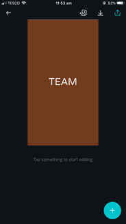
Next, I deliberated about the design of story covers. I used Canva to create these. Did I want text, labelling the genre of content attached to the highlight? Did I want blocks of colour, allowing the titles of highlights to be seen below? I eventually settled on blocks of colour, believing the minimalist design looked professional for the social feed I wanted to maintain.
The creative process for designing highlight covers.


I decided on the colours and overall design in consideration to our audience. The muted, natural colours were calming to the student population. The minimalist design appealed to industry professionals interested in curated social feeds. The maturity of content featured by the magazine also grew with this cohort, and I wanted the uncluttered design of highlight covers to reflect that. This is why I did not make use of emoticons, made clear the genre of content being shared and swatched the colours of highlight covers to the social feed to ensure that the whole page was visually consistent. Overall, I feel the final design is mature, visually pleasing and consistent.
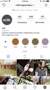
Finally, I decided on what genre of content to attach to story highlights. I settled on four titles – a highlight featuring the team, showcasing behind-the-scenes content; a highlight for Bath Spa University, showcasing the university at which the magazine is produced; a highlight for Bath, showcasing content from the city in which the magazine is based; and finally a highlight for events, allowing information and promotion to be showcased in one place. I believe these four titles summarise the overall theme of the magazine produced by this cohort, encouraging curiosity with the local area, interaction with the wider team and offering a place to discover information.
Before and after of story feature.


Comments